The Accessible Icon Project is an ongoing work of design activism. It starts with a graphic icon, free for use in the public domain, and continues its work as a collaboration among people with disabilities and their allies toward a more accessible world.
Our final icon in white on blue, to keep to the standard color scheme of the original. Now there’s just one wheel, but with two cutouts to emphasize its motion and make it easy to stencil.
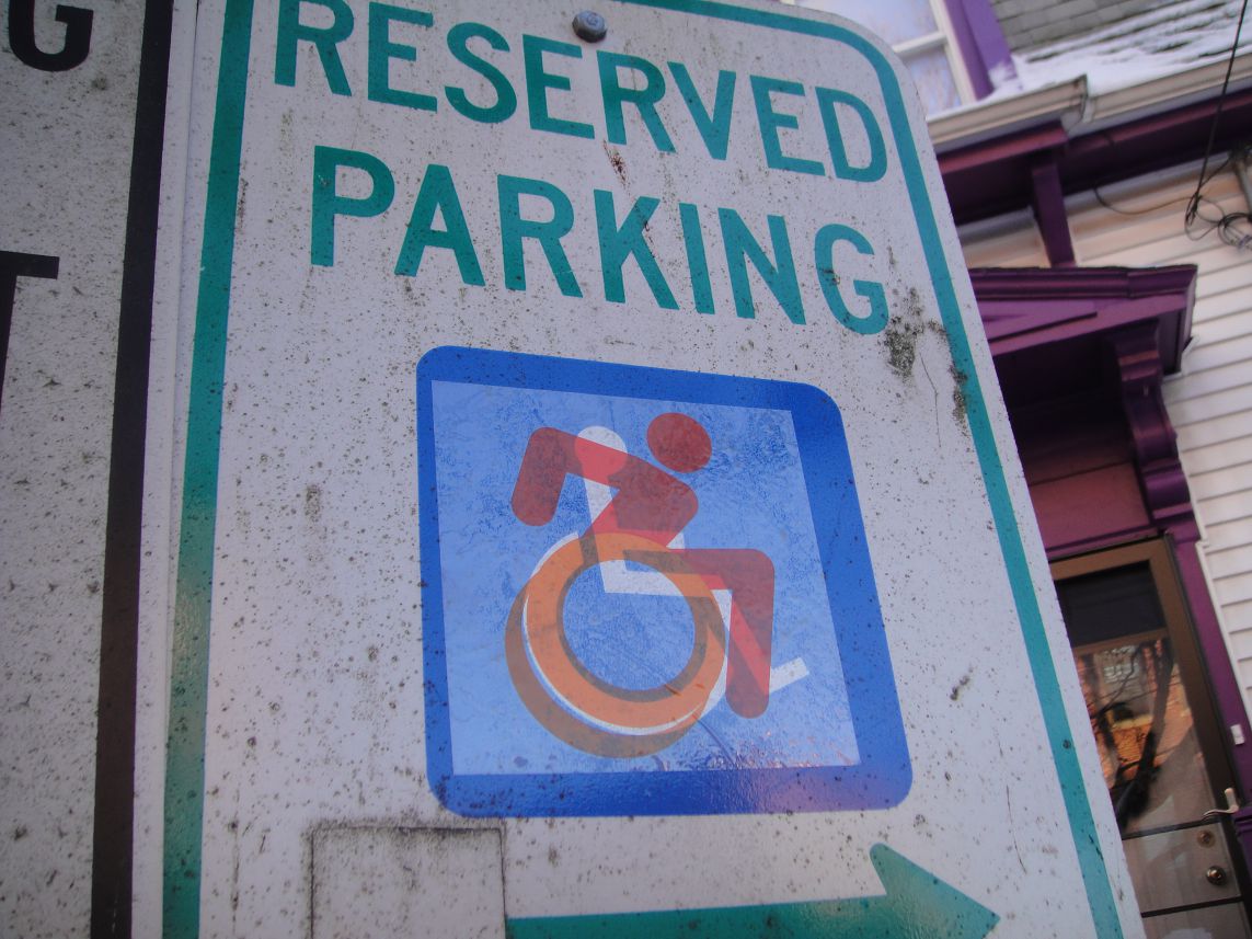
The original International Symbol of Access, designed in the 1960s by Susanne Koefoed. Its provisions are historic and profound. But its rectilinear geometry doesn’t show the organic body moving through space, like the rest of the standard isotype icons you see in public space.
You can see here the ISO DOT 50 standard icons you’d find all over the built environment: for elevators, restrooms, and more. Figures and limbs have rounded, organic ends, mimicking the look of human bodies. We think the new icon adheres to the logic of these standard icons in a complementary, legible way—an “edit” of the important original.